Data wrangling
Query Editor lets you reshape and transform data by, for example, merging multiple data sources and pivoting or unpivoting data. It can also handle common data drudgery like adding, deleting, renaming and moving columns.
For the flight-delay data, you want to combine multiple months into a single table, so don't start changing data within June until you've added July, August and September. Otherwise, you'd have to repeat the same transformations on each file before combining them.
To import more CSV files into this active Query Editor window, click on New Source > CSV and choose a file (you can select only one at a time), give the data preview a quick look and click OK.
Each data source should now be listed under Queries in the left panel. Next, in the Queries panel, click on the table that you want to add data to (for this example, you can choose 2015_06_ONTIME and add other months to that).
Click Append Queries (if your browser window is narrow, Append Queries may be under a Combine button), click on Three or more tables (the default is two tables) and follow the instructions in the dialog box.
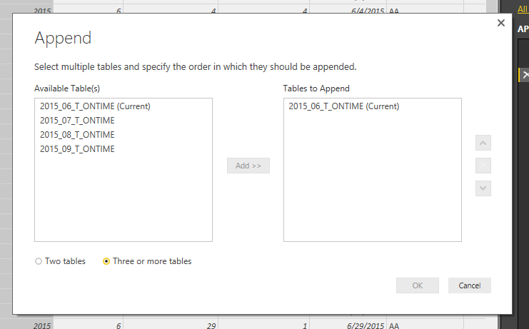
Append Queries lets you combine data sources.
Your 2015_06_ONTIME file should now have four months of data, not just June, so it's probably worth renaming it to something like 2015_SUMMER_ONTIME. You can right-click on it in the left-side Queries panel to rename it; or, with that query active (clicked on from the Queries panel), look at the Query Settings on the right panel and change text in the Name box under PROPERTIES.
Next, let's try merging two tables using a common column -- what's often called a join in SQL or using a lookup table in Excel.
The CARRIER column in 2015_06_ONTIME uses airline codes (such as AA) instead of airline names. It would be nice to have the complete airline names available since not all codes are intuitive -- AA may be obvious, but VX and B6 less so. I created a file of airline codes and carrier names, airlinecodes.csv, that's also available in the Computerworld Insider data download. You can import the file into the current Query Editor window using the New Source button.
On my system, airlinecodes.csv imported into Power BI without the correct column names. Instead, the columns were named "Column1" and "Column2" (obviously the system defaults) while the real column names, "Code" and "Airline," showed up as the first row of data. If that happens to you as well, look to the right on the Home ribbon and you should see an option to Use First Row As Headers. Click on that to fix it.
Next, let's add airline name information to the flight-delay data. With your main data source 2015_SUMMER_ONTIME active, select Merge Queries. In the dialog box that pops up, choose the query table with lookup information, in this case airlinecodes, and then click on the column header for the common column in each table: CARRIER in 2015_SUMMER_ONTIME and Code in the airlinecodes table.
Finally, choose what kind of merge/join you want -- they're described in the drop-down list. For example, the one we want, "Left Outer," means "Keep all rows from the first table whether or not there's a match in the second table." Power BI will now attempt to estimate how many matching rows there are, which is helpful if you've made a mistake and end up with zero matches and thus need to re-examine which columns you're using for the join and whether the data is formatted the same in both.
Everything good? Click OK and the join is done.
After the merge, you'll see a column on the far right of your data table labeled NewColumn, with a table icon to the left of the column name and arrows to the right. Click the arrows to expand that table column to view the data -- you can choose the columns you want to add to the original table.
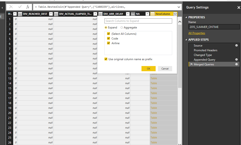
Expand the table column to view the data.
If you want to move that Airline column closer to Carrier, head to the Transform tab. There you'll have the choice to move the new (or any other) column. In this case, using the Power BI interface, you can select the new column and then use the Move > To Beginning and then Move > Right four times in order to get the Airline column next to the Carrier column. But there's a less cumbersome way.
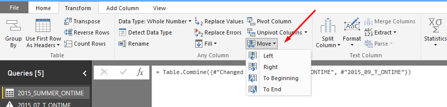
The Transform ribbon has a number of options including moving a column.
First, if you don't see a formula bar above your table, go to the View ribbon and check Formula Bar so it's visible. Then head to the Transform ribbon, make sure the Airline column is selected, and choose Move > To Beginning. You'll now see a formula in the M language that reorders the columns. Click Move > Right and you'll see how the formula changes. It looks like you could just cut and paste the Airline column where you want it to go -- but you can't make changes here.
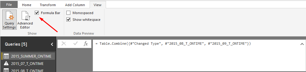
Check the Formula bar under the View ribbon in order to see underlying M language scripts.
Instead, go to View > Advanced Editor and you'll see all your steps as a script. Edit the Table.ReorderColumns line to put Airline when you want it, and click Done. Your Airline column should have moved.
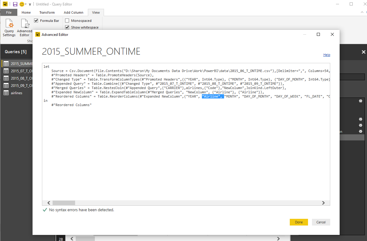
Edit the Table.ReorderColumns line to put Airline when you want it.
There are a number of other operations available on the Transform menu as well, such as grouping values by one or more columns, splitting columns based on a separator or specific number of characters, and pivoting (similar to creating Excel pivot tables) or unpivoting (moving multiple columns of data into two columns: variable data, such as "Month" and value data, such as "June").
You can also do some basic statistical exploration using options on the Transform ribbon, such as counting rows or creating summary stats like count, average, median and standard deviation. When you perform a data summary, a table with the new summarized values will appear in place of your original data table. To get the view of your original data back, go to the Applied Steps column to the right of your data table and delete the summarizing function.
In fact, you can use Applied Steps to delete any step you've taken here, not just the most recent, which is rather handy. Unfortunately, there's not also an Undo after deleting a step in the Query Editor, so you can't bring something back that you've erased.
Select the Count Rows menu option on the Transform ribbon to see the number of rows; if you're using flight-delay files downloaded from Computerworld, you'll see there are slightly over two million rows -- more than you could pull into Excel and its limit of 1,048,576 rows. Delete the Count Rows step to return to the full data.
Right now there are over 50 columns in the summer flight-delay table. To make things more manageable, select just a few that you might want to use in some data visualizations: MONTH, FL_DATE, Airline, FL_NUM, ORIGIN, ORIGIN_CITY_NAME, DEST, DEST_CITY_NAME, CRS_DEP_TIME, DEP_DELAY, ARR_DELAY, CANCELLED, CARRIER_DELAY, WEATHER_DELAY, NAS_DELAY, SECURITY_DELAY, LATE_AIRCRAFT_DELAY.
Click the Choose Columns button on the Home ribbon, deselect Select All Columns and then check the boxes next to the columns you want to keep and click OK.
If you later decide you want to add back any column, you can return to the Query Editor by clicking Edit Queries and then click the settings gear next to Removed Other Columns in the Applied Steps column. That brings the dialog box back up with your prior selections, and you can add more columns to your project.
Finally, make sure to change columns that don't make sense as numbers into text. For example, unless you want Power BI to calculate sums of your flight numbers -- and you don't -- turn them into text. Otherwise, attempting to make graphs with these fields as categories won't work, and you'll end up wasting a fair amount of time (don't ask me how I know). You can convert FL_NUM and MONTH into text by right-clicking the column header and choosing Change Type > Text. Another tweak: The CANCELLED column shows 0 for false and 1 for true -- if you want, you can change that type to True/False.
Now comes the fun part.
Easy visualizations
Close out of the Query Editor with Close & Apply to get back to the main Power BI application. (Because these files are so large, this may take a little while.) At this point you might also want to do a File > Save to save your work as a Power BI project so that if something happens, you won't need to re-create your steps.
Your Power BI blank canvas should look something like this:

A Power BI blank canvas.
It would be nice to get rid of all the other query files that we merged into 2015_SUMMER_ONTIME, since we won't be using them again. If you go to the Fields panel on the right and try to right-click and choose Delete, you'll get a warning that you can't delete those queries because they're referenced by another query. However, you can right-click and then Hide them to get them out of the way.
Do that for all the queries except 2015_SUMMER_ONTIME. Now that there's only one query table left, the 2015_SUMMER_ONTIME table will automatically expand to show its column names. (When there are multiple queries in the menu, the column names don't appear by default; click the triangle next to one to expand it; right-click and choose Expand all to see all the queries' fields.)
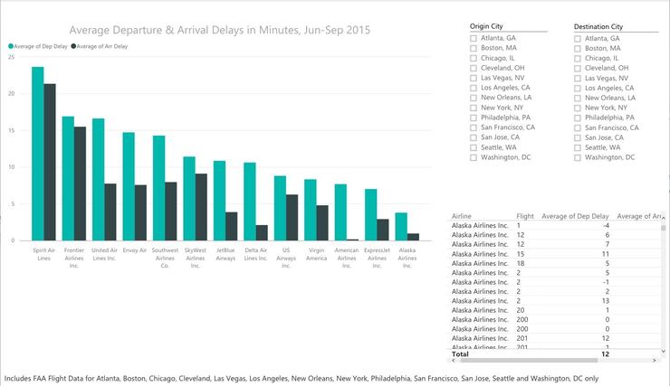
Want to graph departure delays? Click the check box next to DEP_DELAY. You'll get a bar graph with one bar summing all the delay time in your data. (Power BI tries to guess what visualization will work best with your data if you don't specify.) Click Airline, and the graph will morph into a bar graph of each airline's total flight delays.
A sum of total delays by airline isn't that useful, though; the more flights an airline has, the more minutes delayed it's likely to have. But if you look under the Visualizations panel and find DEP_DELAY under Value, you can click the triangle drop-down menu and change the Sum of DEP_DELAY minutes to Average (or Median, if you prefer).
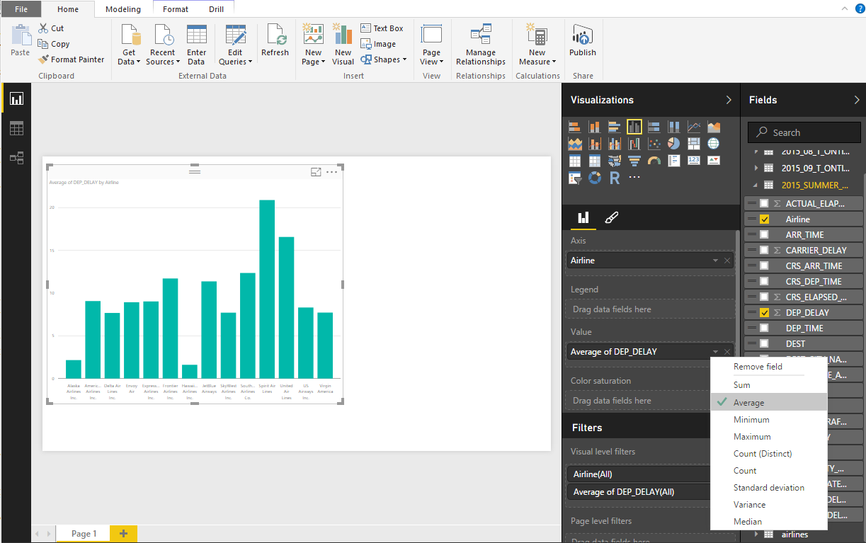
Clicking the triangle next to a Value field brings up visualization options, such as changing Sum to Average.
(If the graph is too small, just click and drag a corner of the box to resize it.)
The graph is currently sorted by airline alphabetically. If you want it sorted from highest to lowest, click the ellipsis at the top right and choose Sort By > Average of DEP_DELAY.
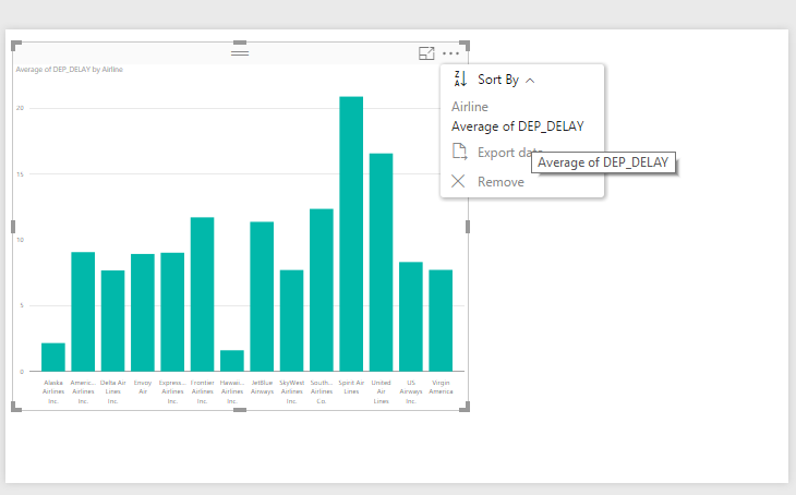
Clicking the ellipsis at the top right of a graph brings up sorting options.
Arrival delays would be interesting, too. Drag ARR_DELAY onto the Value area of the panel and change it from Sum to Average. Click the ellipsis again at top right to sort by ARR_DELAY descending (if it defaults to ascending, just click again). You should now have a graph that looks like this:
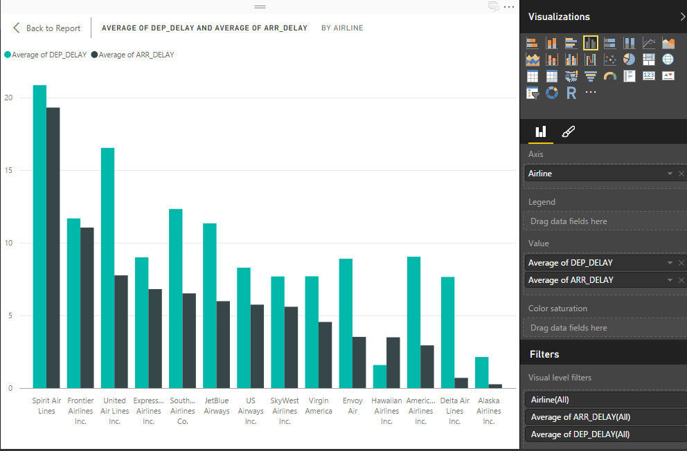
A graph showing departure and arrival delays.
(You can see a version of your graph that takes up the whole canvas by clicking on the "Focus mode" icon next to the ellipsis at the top right of the graph's borders.)
The default title is a little lame. You can change the title and a lot of design defaults by clicking the brush icon just below the Visualizations options. To edit a specific graph, make sure you click it so it's active (the bounding box is visible). Click on Title and you'll see options to change the title text, font color, size, alignment and so on.
There are also options to add data labels to the bars, change the X- and Y-axes, and more.
For example, you can change the title to Average Departure & Arrival Delays in Minutes, Jun - Sep 2015, bump up the text size and center-align. If you want to rename fields, you can do that on the Fields panel -- right-click a field and choose rename. Try changing DEP_DELAY to Dep Delay and ARR_DELAY to Arr Delay.
Well, it sure looks like Spirit Airlines wasn't the best choice last summer -- but maybe the airline has big delays in some airports but not others? We can revise the visualization to include just a few airports.
There are a couple of ways to narrow in on a subset of data. Filters can apply to one graph, the entire page or all pages in a multi-page report. You can change filters while editing a report; but if you subsequently share your work as a Power BI dashboard, read-only users will see only what you filtered and won't be able to add data back in.
Another choice is to add an interactive slicer. With slicers, if you later share your work with others, they can interactively filter data and add it back in.
Let's try both.
[Continues on next page]
Join the CIO Australia group on LinkedIn. The group is open to CIOs, IT Directors, COOs, CTOs and senior IT managers.