Filtering your data
When I started working with Power BI in March, a major drawback was that you couldn't add a text search box to a report, table or slicer. If you were analyzing information with a lot different categories, such as U.S. flight data, it was pretty annoying to have to scroll through hundreds of cities on a list in order, say, to find St. Louis.
As of the June 30 Power BI Desktop software update, you can add a text-searchable slicer to your reports, making it easier to hone in on one item amidst hundreds (or thousands). More on that in a bit. But it's also possible that you know there are only a few items of interest among the hundreds in your list, and you'd like to create a report with just a subset of the data.
One way to do this is to filter a report down to a few key categories -- in this case, perhaps showing only some cities that are of known interest, such as where your company has offices.
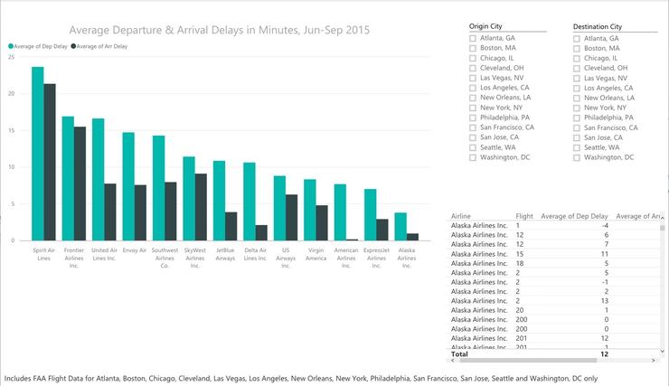
To do this, click on an empty area of the canvas and then drag DEST_CITY_NAME onto the Report level filters (where you see the "Drag data fields here" area). Pick a few cities. If you're following along, I chose Atlanta, Boston, Chicago, Cleveland, Las Vegas, Los Angeles, New Orleans, New York, Philadelphia, San Francisco, San Jose, Seattle and Washington, D.C.
Click the DEST_CITY_NAME header on the filter to close it. Then do the same for ORIGIN_CITY_NAME -- drag it on top of the DEST_CITY_NAME filter and select the cities you want -- and you'll just have info for flights between your key cities.
At this point, it may be worth noting on the report itself that the data is now only for a few cities. You can add text to the page by clicking on the Text Box button on the Home ribbon. Move and shape it the way you want on the canvas and then write some text explaining which cities the report covers.
We can now make it easy for users to pick origin and destination cities by adding a couple of slicers. Click onto an empty area of the canvas, then click on the slicer visualization icon (it looks like a little filter/funnel on a table icon under Visualizations -- in the May 2016 version of Power BI, it's the third from last icon under Visualizations). Check ORIGIN_CITY_NAME. Now click on an empty area of the canvas again, click on the slicer icon a second time, and then click on DEST_CITY_NAME. Size and move slicers around the canvas as you like.
If you still have enough cities in your slicer that adding a search box is worthwhile, click the ellipsis in the top right of the slicer and select Search. That will add a text search box to the slicer.

Adding a search box to a slicer.
If the text is a little small and hard to read, click on each slicer, then click the brush icon and choose a new text size under Items. Just as with the graph, you can change the title and click on the fields to rename them (from, say, ORIGIN_CITY_NAME to Origin City and DEST_CITY_NAME to Desintation City) and increase the Header font size.
You can probably now see the benefit of filtering the data first: Without that page-level filter, there would be more than 300 cities to scroll through on each slicer.
Finally, it might be interesting to see the actual flights, not just the airline. Drag Airline to an empty spot on the canvas and then add FL_NUM. You'll get a table. Add Dep Delay and Arr Delay, and then once again make sure to change both from Sum to Average (under Values). Rename FL_NUM to Flight. You can add the scheduled departure time by clicking on CRS_DEP_TIME and adding that to the table, too.
Now when you click on an origin and destination city in the slicers, you'll see all available flights and their average arrival and departure delays. If you click on one airline's bar in the graph, the table will show just that airline's flights.
(Note: It's not very easy to find, but you can customize how the graphics on your page interact with each other. Click on one graphic to activate it; then on the Format ribbon, choose Edit Interactions. The other graphics on the page will all have some additional icons: A filter and a circle with slash through it. Clicking on the filter means that graphic will change based on what happens in the active graphic; clicking the circle with slash means it will not.)
It's also easy to take the same graphics and decide to look at medians instead of averages, since a few unlucky very late flights could have an outsized effect on overall averages. As in Excel, you can add a page to your Power BI report by clicking the plus sign next to the tab with the page name (default should be Page 1).
Even handier, since we've got slicers and a graph all set up: Right-click on the page and duplicate it. It's now pretty easy to click on the graph; under the Value section, click on Average of Dep Delay and Average of Arr Delay and change each to Median. If you're following along, you'll also want to change the title of the graph and the table with flight data from Average to Median.
Every airline had a 0 or below median arrival delay for all these cities combined -- except for Spirit. When I just look at flights arriving in Boston, Spirit's delays look even more pronounced -- although to be fair, they might have just had a bad summer in 2015 and improved since then.
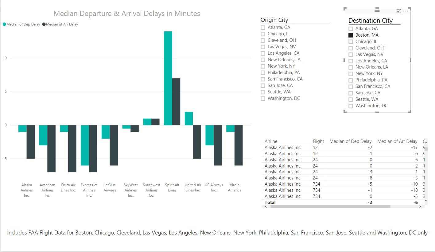
A graph showing flights arriving in Boston.
Interactive drilldowns
Interested in how average delays break down by month? Power BI has automatic drilldown by date fields, which we can see by creating a new visualization on a new page.
Again, right-click on Page 1 and duplicate it, click on the graph to activate it, then unclick Airlines and click on FL_DATE. You'll only see two bars on the chart, one each for arrival and departure.
That's because Power BI defaults to graphing by year, and we've only got one year's worth of data. Under Axis, you can click the x next to Year to delete that so the graph will stop aggregating annually (which is somewhat useless for this data). It now defaults to Quarter. That, too, isn't much use for this particular four-month data set, but let's pretend it is.
To enable Power BI's date drilldown, click the down arrow at the top right of the graph. Now, if you click one of the third-quarter bars, it will drill down to show you months. Click a month's bar, and it will zoom in on days for that month.
To go back up to larger time groups, click the up arrow at the top left of the graph. Note that while you're drilling up and down, you'll no longer be affecting other visuals on the page, so data on the table won't change.
The date drilldowns are automated for date fields, but you can set up drilldowns for any hierarchy. Activate the graph on the first page, then drag FL_NUM onto the Axis field, making sure it ends up below Airline. Nothing will appear to change on the graph except that drilldown icons appear.
Click on the down arrow at the top right to activate drilldown, click on an airline's bar, and you'll see all the data for that airline's individual flights. Again, because drilldown is active, you won't see any changes on the table. If you want to be able to manually filter the table for a specific airline while this is going on, you can either temporarily add Airline as a page-level filter or add a third slicer for Airline.
Click the up arrow at the top left to get back to the original graph, click the down arrow again to deactivate drilldown capabilities if it's still selected, and the graphic will work as it did before.
If you want to change the headline for the graph on this page, make the graph active once again, click the brush icon on the Visualizations panel and then click on Title.
For a final step, you may want to rename the page tabs from "Page 1" and "Duplicate of Page 1" to something more meaningful. This doesn't currently work the same way as in Excel -- instead of right-clicking a tab, you need to double-click on the tab name.
There are a lot more visualizations you can generate within Power BI. In addition to all the icons in the Visualizations panel, including tree maps and actual geographic maps, there are other graphics available for import from the Custom Visuals Gallery. If you find one you like, download it from the gallery and then import it using the ellipsis next to the last icon in the Visualizations panel. You've got to import it separately into any report where you want to use it. (You can find an example of one of the more recent custom visuals created by Microsoft Research here.)
There are a lot of other ways to visualize this data, such as looking at the columns with reasons for delays, but for now I'll move on.
[Continues on next page]
Join the CIO Australia group on LinkedIn. The group is open to CIOs, IT Directors, COOs, CTOs and senior IT managers.