The business information (BI) market is fierce and crowded. Historically, the big players — think Oracle and IBM — engaged in feature wars to try to justify budget-stretching (if not budget-busting) pricing, and relied heavily on high-touch salesmanship. To make matters worse, the vendors expected your IT department to work with the vendors' own consultants to configure their products and integrate them with each of your systems of record, often at additional cost.
Once a traditional BI system was installed and running, managers had to wait for weekly or monthly line-of-business reports, meaning decisions often took a month, plus another month to implement. Adding a report required a request to woefully-backlogged IT, and could take weeks or months to design and code.
That all changed with the 2004 introduction of self-service BI, exemplified by the five platforms I'll cover in this comparison — Domo, Power BI, Qlik Sense, QuickSight, and Tableau . The transition to self-service BI was in part fueled by the ability to make business decisions in days rather than months. Of late, the availability of cloud computing and high-speed internet access have been key technical drivers of self-service BI.
Of course, traditional BI is still alive and well, although somewhat diminished. Financial reporting in particular requires 100% accuracy and usually allows weeks for producing reports. Reporting turns out to be a separate use case that may not always be well-served by self-service BI products, which emphasize interactive visual discovery, although some of the newer platforms attempt to completely replace traditional BI systems.
Meanwhile, traditional BI platforms are also evolving. Some have added enough self-service, visual discovery, and analytics to satisfy the needs of existing customers.
Criteria for picking a self-service BI platform
Performing your own evaluations when selecting a self-service BI platform is key, since many of the features the vendors tout may not have real benefits for your enterprise. For example, if your company already has a high-performance data lake, you may not want to pay a differential for a BI platform that imports all data into its own store. Similarly, you may prefer to integrate the BI system with a collaboration platform already in place rather than use a dedicated BI collaboration feature, since asking employees to use two collaboration systems is generally a non-starter.
[ Deliver deep insights with the 7 keys to a successful business intelligence strategy and learn why machine learning is the new BI. | Get the latest business intelligence and IT strategy analysis by signing up for our newsletter. ]
If most of your data is on Azure, you might want to rule out BI systems that run only on Amazon Web Services, and vice versa. If possible, you want the data and the analysis to be collocated for performance reasons.
Vendors tend to cite analyst reports that are most favorable to their product. Don't trust the vendor's skimmed abstract or take the diagram they show you at face value: Ask for and read the whole report, which will mention cautions and weaknesses as well as strengths and features. Also take the fact of inclusion in an analyst's report with a large grain of salt: Most big analysis firms take more interest in paying customers than in vendors that are not their clients, despite the individual analysts' sincere attempts to be fair and neutral.
Following are seven key areas of concerns when evaluating self-service BI platforms.
Data sources
You need to ensure that a BI platform can read all your data sources. Second, you’ll want to know whether the platform has to import data into its own store before processing it, or if it can process data queries on the fly.
If it has to import data, is the analysis speed fast enough to justify the import time? Can the BI system automatically update the data from the original source?
If there is a charge for data storage in the BI system, take your wildest guess about how much data you'll have in 5 years and triple it. Would the cost to store that amount affect your budget?
Another key question: Can the BI system run where your data resides? If not, how hard would it be to move your data?
Data transformations
Data is always dirty when you collect it. Fields may be missing from a row, or may contain nonsensical values. Multiple fields within a row may have mutually inconsistent values. Text fields may contain misspellings, spelling variants, or variations in terminology that keep them from being grouped together automatically. Some fields, especially free-form comments, may be very long and of little use.
Furthermore, fields may be non-parametric (text) and need to be encoded as numbers for analytic purposes, although some BI systems automate this internally. Numeric ranges of fields may differ by orders of magnitude and need to be normalized. Values may need to be inferred from other values, for example sex may need to be inferred from first names and/or titles for statistical purposes if not already present in the source data.
A BI system may require you to write SQL SELECT statements, or it may perform imports itself. If it requires you to write database queries, does it assist you in picking fields and creating joins?
These and other concerns mean you should try out a BI system on some of your data. Build an extract/transform/load chain while looking at and graphing your data. See how easy or hard it is. Compare that to other BI systems. Don't underestimate the time you'll need to spend cleaning up data for analysis — it can easily account for 80% of total analysis time.
Analytic power
You'll want to analyze cleaned data in several ways. At the simplest level, you'll plot data in various formats, and perform straightforward statistical analysis on historical data and trends. Beyond that, you'll want to dig into the data to understand specific features, and build models to test your ideas about causes. Finally, you may want to predict future performance indicators (sales and inventory requirements, for example) based on statistical models and even machine learning models.
One feature war you'll encounter is in the number of chart types provided. This is often meaningless when a hyped chart type doesn't apply to your data. On the other hand, some chart types are important: For example, I would be reluctant to use a system without geographic display support, as seeing raw numbers in a table of locations doesn't have the same visual and intuitive impact as seeing different colors or varying bubble sizes on a map.
Support for analysis is another feature war. Yes, you absolutely should be able to perform simple statistics within the BI platform, at least up to and including regression models. To go much further may be an impedance mismatch with users.
For example, adding machine learning and deep learning support to the options for exploratory BI analysis may be a bridge too far for managers and business analysts. Data scientists are another story, but they typically have dedicated, specialized workspaces for creating ML models and deep neural networks, using workflows that often require a great deal more statistical knowledge and programming skill than the typical BI user possesses.
On the other hand, natural language support and built-in intelligence for analyzing common data patterns make a platform easier for unsophisticated users. Applying machine learning to the user experience is often good, even if asking business analysts to train deep learning models may be fruitless.
Some BI platforms now use in-memory databases and parallelism to accelerate queries. In the future, you may see more highly parallelized GPU-based databases built into BI services — third parties are building these, demonstrating impressive speedups.
You will often need to revise or augment data transformations during analysis, for example by adding columns that reflect differences or ratios between other columns as is often done in financial analysis (e.g. debt/equity). Such revisions can sometimes change the import process from an ETL (extract, transform and load) pipeline to ELT (extract, load, and transform). Some vendors support only one of ETL or ELT, but most BI systems that use ETL have provisions for additional transformations in the analysis step.
Ease of learning and use
Despite being aimed at managers and business analysts, self-service BI systems are complicated and have many moving parts. The quality of the user experience and learning materials varies widely among the BI platforms I have tried. Try to involve several potential users at various skill levels in your evaluation to see how they react. Also be sure to test the documentation itself. There's an enormous difference between the best documentation search, indexing, and organization and the worst. I have at times been reduced to asking a sales engineer to find a tutorial for me after a significant but failed personal effort.
Presentation flexibility
Some BI systems show reasonably informative charts for practically any choice of variables. Other BI systems wait for you to click on exactly the type of chart you think you want to see. If you know what you want and need, either approach will do; if not, it's better if the system offers help based on the number and kind of variables you've chosen.
Often BI systems distinguish between measures, which are always numeric, and dimensions, which can be non-parametric. Some sets of dimensions, for example City, State, and Country, can be transformed into measures such as latitude and longitude. Sometimes you want to see measures qualified by dimensions, e.g. "show me our profit ratios by product" or "show me our year-over-year sales by store," and other times you want to see measures qualified by other measures, e.g. "show me profits versus sales for all stores in the Midwest."
Once you have seen a meaningful graph, you often want to zoom in on specific features, tune the display, and add annotations. BI systems differ quite widely in this area, so it's worth doing the exercise.
Collaboration options
Exactly what you can share varies from system to system, and by whether you want to share with fully licensed users, read-only registered users, or unregistered users. In some cases, read-only users can sort and sift data from charts you supply; in other cases, they can only see slide shows made from your analyses.
This distinction often has a large effect on whether you will be able to afford the BI product for your whole company or only a select audience, coupled with the pricing, of course.
Costs and benefits
By costs I don't mean only the vendor’s yearly fees, but also the costs to store your data, host the platform on-premises or in the cloud, and train your people. Benefits include reduced labor and time to reach decisions, better decisions, and ultimately improved profits and growth.
The best self-service BI tools available today
With these considerations in mind, let's examine (in alphabetical order) five market-leading BI platforms.
Domo
Domo is an online BI tool that combines a large assortment of data connectors, an ETL system, a unified data store, a large selection of visualizations, integrated social media, and reporting. Domo claims to be more than a BI tool because its social media tool can lead to “actionable insights,” but in practice every BI tool either leads to actions that benefit the business or winds up tossed onto the rubbish heap.
Domo is a very good and capable BI system. It stands out with support for lots of data sources and lots of chart types, and the integrated social media feature is nice (if overblown). However, Domo is harder to learn and use than Tableau, Qlik Sense, QuickSight and Power BI, and at $2,000 per user per year it is multiples more expensive.
Depending on your needs, Tableau, Qlik Sense, or Power BI is highly likely to be a better choice than Domo.
Power BI
Power BI, Microsoft's entry into the self-service BI fray, includes a web interface to a service hosted on Azure and a Power BI Desktop application for the Windows desktop. It’s much more modestly priced than the competition: A standard account is free, a Pro account is $9.99 per user per month, and the Power BI Desktop is free.
Both the website and the desktop application are updated on a regular basis. The Power BI Desktop is updated monthly; it’s hard to tell when the site is updated.
For some data sources, Power BI has predefined charts, dashboards, and reports. For example, the default Visual Studio Online dashboard and report provide at-a-glance views of Git, pull request, and version control activity across the projects you configure for your account. For other sources, Power BI expects to see certain markers for its data. For instance, it supports Excel Worksheet named tables, Excel Data Model tables, and Power View sheets. If you only have raw data in your Excel worksheet, you need to go back to it and create one or more named tables; it also helps if you make sure your data types are correct prior to import.
Power BI is a reasonable choice for companies that use the Windows, Office, and Azure ecosystem. It's also a good choice for cost-sensitive companies that want to provide BI to everyone in the organization. On the down side, Power BI does not give you as much analysis capability or control over your charts as Qlik Sense or Tableau.
Qlik Sense
Qlik had a "Mode 1" or traditional BI product in QlikView, and has expanded to self-service BI with Qlik Sense. Introduced in 2014, Qlik Sense is a do-it-yourself BI and visualization product based on the same in-memory associative data-indexing engine as QlikView. In 2016, Qlik added its reporting engine, previously available only with QlikView, to Qlik Sense.
Qlik Sense 2.0 is a very capable data discovery and interactive analysis tool. It can connect to virtually any SQL database, and it offers a good deal of control over visualizations. However, it is not as easy to learn, as easy to use, or as flexible in the presentation of visualizations as Tableau.
Data import for BI is often a messy process. Qlik Sense 2.0 tries to associate identically named fields in different tables, but also compares the data and makes recommendations about similar fields. This new feature is called Smart Data Load.
Qlik Sense 2.0 also introduced the Qlik DataMarket, a source of public and commercially available data in six categories: business, currency, demographics, society, weather, and the economy. Having public data helps quite a bit when you're analyzing your private data.
Qlik normally keeps data in memory in compressed form. There are times, however, that you have too much data to fit into available memory, in which case, Qlik Sense can use "direct discovery" mode, which combines in-memory data with in-database data on demand. In direct discovery mode, some fields are loaded into memory only as metadata/symbol tables that can be used in expressions. The actual data residing in the database will be queried as needed.
When working with Qlik Sense, you can save a bookmark to the current selection state of the current sheet, and you can combine bookmarks into stories and add text and other annotations to make the story self-explanatory. If you're using a story for a live presentation, you can drill down to the source for any visualization to answer a question, then return to the story when you've answered the question.
Qlik's associative green-white-grey experience in which colors of displayed values indicate state (selected-selectable-not selectable) helps you to spot both related and unrelated data without having to dig — a very nice touch. I also like Qlik's way of defining expressions, but not quite as much as I like Tableau's. Qlik Sense offers good control over the appearance of visualizations — better than Microsoft Power BI, but not quite as good as Tableau.
QuickSight
Amazon QuickSight runs entirely in the AWS cloud, has good access to Amazon data sources and fair access to other data sources, and offers basic analysis and data manipulation at a basic price. Of the other products discussed here, QuickSight most closely resembles Power BI, only without the dependence on a desktop product to create data sets — or the level of analysis power provided by the Power BI Desktop/Service combination.
Like Power BI, Qlik Sense, and Tableau, QuickSight connects to myriad data sources and lets you prepare data sets. Once you have data sets, you can create analyses with one or more visualizations, which you can organize into dashboards and stories. You can share data sets, dashboards, and stories within your organization. QuickSight makes this process quite easy and straightforward, but it lacks some useful visualization capabilities found in competing tools.
The first user in a company is free forever, and a team trial with four users is free for 60 days. Beyond the trial, additional users cost $9 per month each for the Standard edition or $18 per month for the Enterprise edition.
The first QuickSight user gets 1GB of SPICE (Superfast Parallel In-memory optimized Calculation Engine) storage, and additional users include 10GB of SPICE. Additional SPICE storage costs 25 cents per gigabyte per month for the Standard edition or 38 cents per gigabyte per month for the Enterprise edition. The Enterprise edition adds secure data encryption at rest and a connection to your organization’s AWS Active Directory.
SPICE is QuickSight’s high-performance in-memory data store for visualizations and is required for data imported from files and optional for data in SQL databases. SPICE tables are limited to 10GB each.
For a shop with many data sources hosted on AWS, limited analysis needs, and limited development time, using QuickSight appears to be a no-brainer. QuickSight adds easy analysis and visualization capabilities for a nominal cost.
Tableau
Tableau describes its products as offering “analytics that work the way you think” and says these tools harness “people’s natural ability to spot visual patterns quickly, revealing everyday opportunities and eureka moments alike.” There’s a certain amount of truth in that, although you could say almost the same thing about many other BI tools.
 IDG
IDGThe visual discovery phase of the analysis workflow is the sexy part, but it’s not where most people spend most of their time. In my experience, importing and conditioning the data can easily consume 80 percent of the time you spend with a BI product.
Now that Tableau can do cross-database joins, you’re likely to import multiple data sources and join them, although you might have most of them hosted in your data warehouse, if your company is big (or rich) enough to have one.
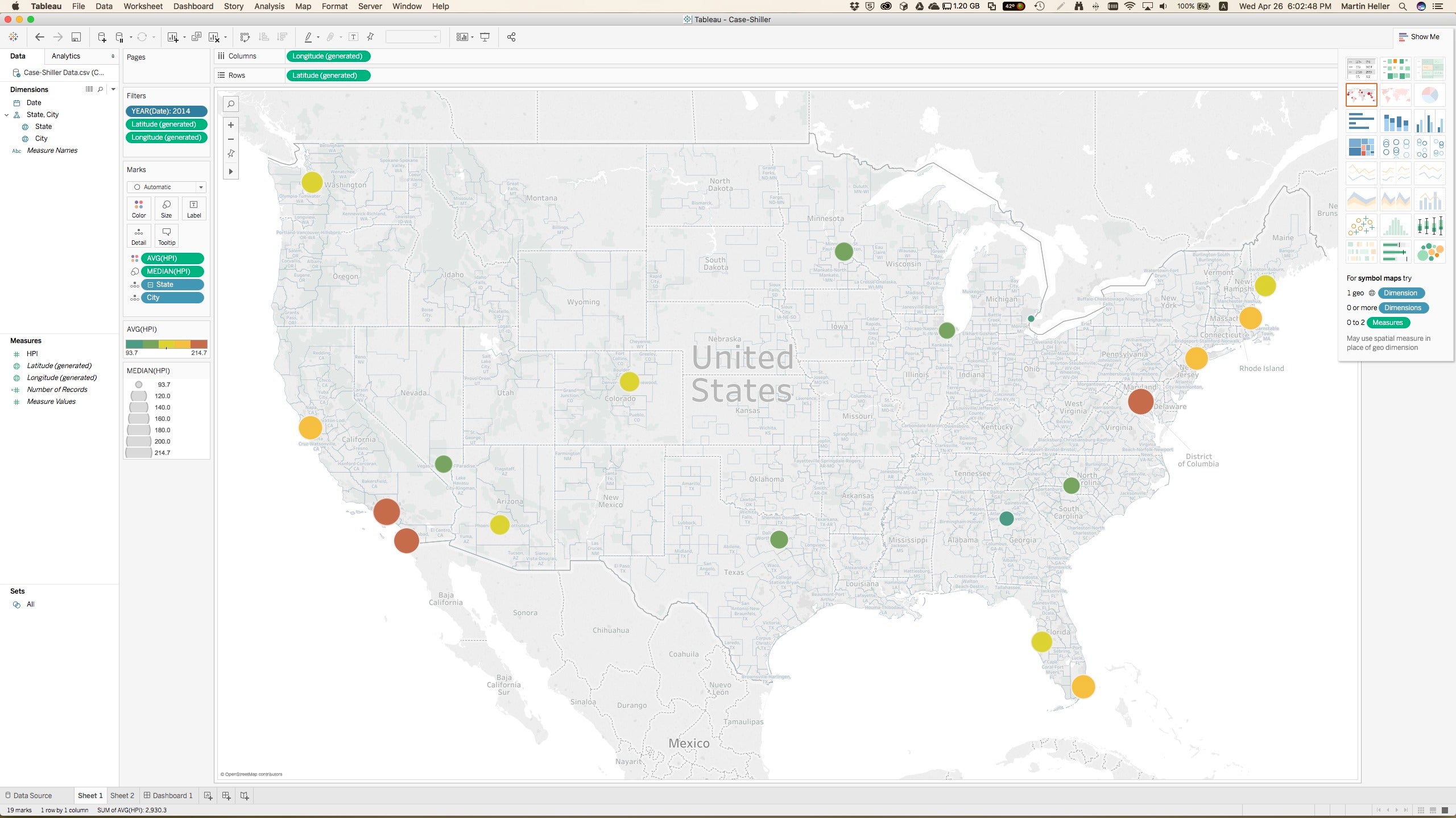
Then you’re going to want to filter and condition your data on a row-by-row basis. Finally, you’ll get to the point where you can actually start creating visualizations such as the screenshot above, although it’s not unusual to have to perform additional data transformations while you’re trying to do your exploration. But data conditioning and transformation are easily accomplished in Tableau, certainly as easily as they would be in Excel. There is no need to go back to the import stage to add computed fields or filter the data.
Visual discovery in Tableau is powerful and Tableau has set the bar for its easy-to-use implementation and fine control of the chart display. You build a Tableau visualization by clicking on or dragging the dimensions (typically discrete categories or characteristics) and measures (numeric values) of interest, and either choosing a mark (the type of display, such as bars, lines, and points) yourself, or using automatic mark selection, or using the “show me” method for selecting the visualization.
For more control, you can drag dimensions and measures onto specific mark characteristics or “shelves.” When you understand what’s happening in your analysis, you can share dashboards and stories with others. That’s easily done by publishing to Tableau Server or Tableau Online, whether you’ve been working in Tableau Desktop and need to upload, or you were already doing your analysis online.
Tableau pricing has become quite competitive, at least compared to Qlik and Domo. Personal edition: $35 per user per month; Professional edition: $70 per user per month; Tableau Server: $35 per user per month; Tableau Online (fully hosted): $42 per user per month.
I must note, however, that Microsoft Power BI offers something like 80 percent of Tableau’s features for about 25 percent of its price. Whether that calculation holds up when you account for labor costs and benefits to your company is something you'll have to determine for your own situation.
Related business intelligence and analytics articles:
Join the CIO Australia group on LinkedIn. The group is open to CIOs, IT Directors, COOs, CTOs and senior IT managers.