LinkedIn releases major website redesign
- 20 January, 2017 08:55

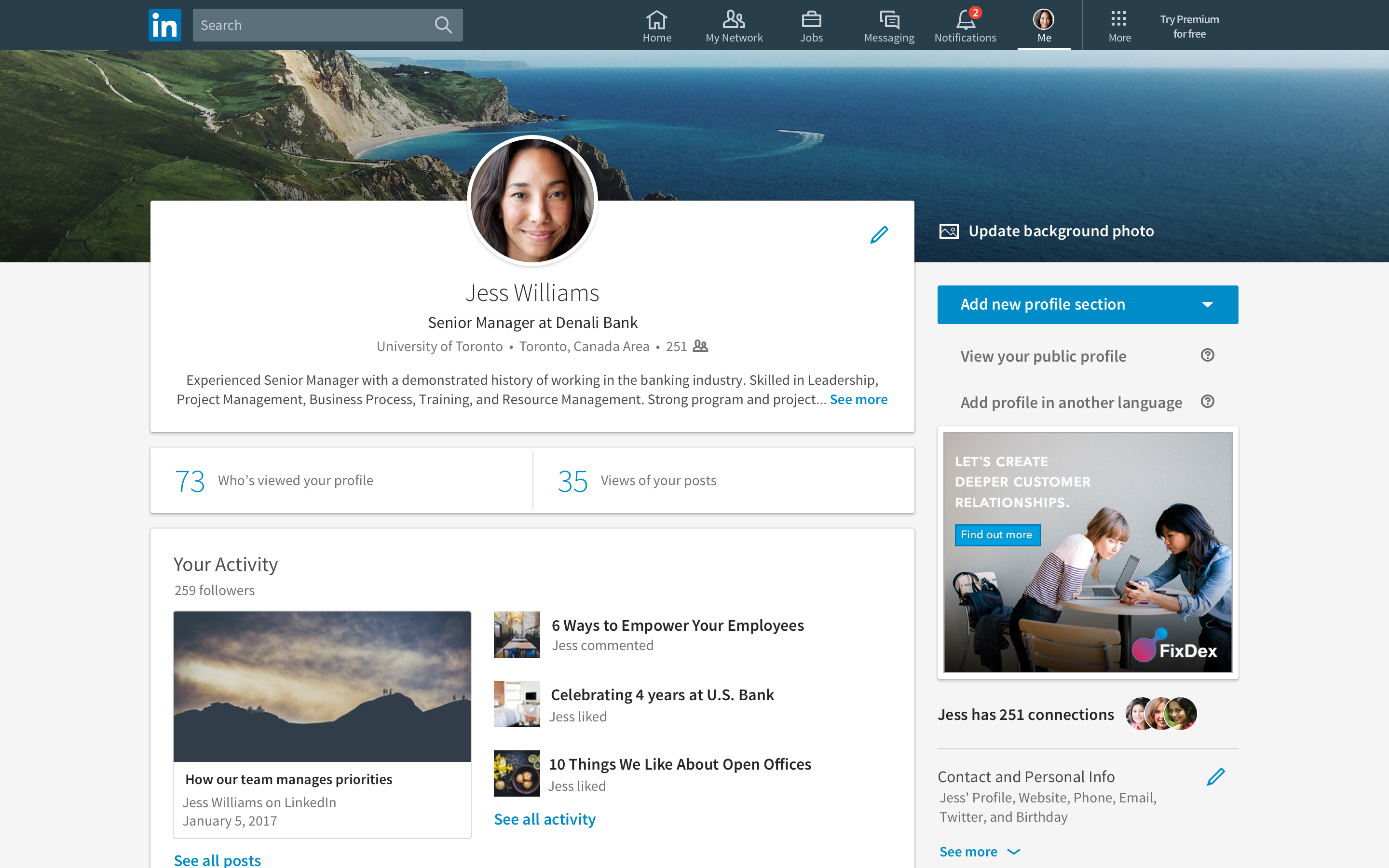
LinkedIn has a new look. The professional social network today launched a redesign of its desktop app that designed to reduce clutter and puts conversations and content in a more prime location.
 LinkedIn
 LinkedIn's new design aims to reduce clutter and put conversations and content in a more prime location. (Click for larger image.)
The redesign, which was first previewed in a media briefing at LinkedIn’s offices in September, is the most noteworthy change to LinkedIn.com since it was founded 15 years ago, according to the company.
LinkedIn committed much of the past few years to design a better mobile experience and a suite of apps built from scratch to deliver objectives that are paramount to LinkedIn’s value proposition. The new desktop design takes obvious cues from LinkedIn’s mobile apps.
LinkedIn.com brings media and messaging to the forefront
The new simplified design will roll out to all of LinkedIn’s 467 million members during the coming weeks, according to the company. You will also gain access to a restructured “Interest Feed” that was developed to give people more curated information and opinion on topics relevant to their profession. The company has pursued news and commentary curation in the past without much success, but it hopes a larger editorial staff and improved algorithms will surface more meaningful content by targeting the most important topics in their industries.
 LinkedIn
 A new “Interest Feed” is designed to give you more curated information and opinion on topics relevant to your profession. (Click for larger image).
LinkedIn has also demoted some of its assets as a result of the new desktop design. Linkedin Learning, the recently rebranded service the company acquired through its $1.5 billion acquisition of Lynda.com in 2015, is surprisingly missing from the navigation menu, for example. You now have to click on the “more” icon on the navigation bar to launch LinkedIn Learning and other services.
[ Related: Why Facebook, Google, LinkedIn and Slack tackle the enteprise differently ]
The desktop version of LinkedIn is now built around seven core areas: Home, My Network, Jobs, Messaging, Notifications, Me and Search. “Learning” and “Interests” have been removed from the navigation bar and pushed into a second tier of features. A new messaging interface is active throughout LinkedIn and the company says it will start helping its users with conversation starters or ideas to spark new connections that could advance their careers.
LinkedIn is also investing in search as it moves to expand queries beyond people, jobs, companies, groups and schools to articles that have been published on the platform. Finally, the company says you will be able to learn more about who is reading and engaging with the content you share on LinkedIn. Collectively, these changes will help LinkedIn innovate faster, especially now that it’s a fully owned subsidiary of Microsoft, and put a greater emphasis on helping its users be more productive and invested in their careers, according to the company.