Sharing your work
After you've done some exploratory visualizations, you might want to share some of your analyses with co-workers. To do this, you first need to publish your data and report to the Power BI cloud service. Save your work, then go to Home > Publish. You'll need to sign into your Power BI account if you're not currently logged in (or create one if you don't yet have one).
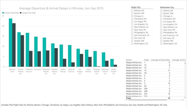
After data is published to the Power BI cloud service, you'll be offered the chance to "Get Quick Insights" from your data. This is Microsoft's automated look through various data points in order to highlight things like outliers and correlations. Unfortunately, Quick Insights doesn't know that it shouldn't add together all the delay times -- it needs to average them to be meaningful. (I expect the default would work a lot better for files of data like sales and profits, where sums by region or store over time could make sense.)
I tried out Quick Insights by duplicating my project (I did a Save As to another name), and then grouping data by destination city, airline and flight. (If you want to follow along, go to Edit Queries > Transform > Group By and follow the dialog box to create a new column of average arrival delays, select Close & Apply, re-do your visualizations, then publish).
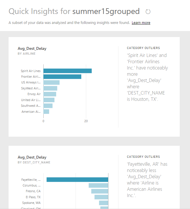
Quick Insights attempts to call out interesting aspects of your data. In order for this to work properly, however, your data needs to be in a format that it can understand.
To get Quick Insights on a data set within the Power BI cloud service, click on the ellipsis next to its name in the left-hand menu (click the three-line menu icon at the top left to show the menu if it's not visible) and choose Quick Insights. (Can't find Quick Insights? Make sure you're doing this under Datasets and not under Reports.)
After looking at Quick Insights, go the main Power BI cloud page, sign in if you need to, click the three-horizontal-line icon at the top left to view the menu (if necessary), and you should see all your Datasets, Reports and Dashboards. If you already created visualization report pages in the desktop software before publishing to the service, they'll show up under Reports (your data, not surprisingly, shows up under Datasets).
You can share a report directly to the web for public viewing, which then also allows you to embed it somewhere on your own website: Go to File > Publish to Web. Be advised that although this was free while in beta, I haven't seen Microsoft guarantee that it will stay free since it moved out of preview in early July.
If this is private data you want to share with just a few other people, you'll need to share your work as a dashboard instead. If you'd like to share an entire report page as a dashboard, click the pin (thumbtack) icon just above the page and choose to add it to a new dashboard. You can also mix and match visualizations from different pages -- or even different data sets -- onto a dashboard by clicking on an individual visualization and then clicking on the pin icon at the top right of that visualization and pinning it to an existing or new dashboard. You can then click the share icon at the top right and share with others by entering their email addresses.
The dialog box is pretty self-explanatory, letting you decide whether recipients can re-share or just view. (As of this writing, row-level security is available for some data sets, allowing only certain users to see more sensitive information in a data set, but some of the features are in preview and are likely to change.)
You can embed web content, images, text boxes and videos into a dashboard from the dashboard itself; you can also create additional visualizations in a report and pin them to a dashboard, including adding "cards" that call out one or a couple of key metrics. You can edit your report in Power BI service by clicking the Edit Report link above the page and then pinning a new visualization to any dashboard.
You can allow your users to ask natural-language questions by clicking the setting gear icon on the top (black) nav bar, clicking Dashboards and then the specific dashboard you want to edit. Click the checkbox next to "Show the Q&A search box on this dashboard."
This feature lets you (or your dashboard viewers) generate new visualizations from a data set by typing in questions. Once I figured out appropriate formats for my queries, I found this a pretty compelling interface. For example, I imported data for monthly search visits to IDG's U.S. websites and then was able to view various slices of the data by typing in things like "Show me search visits by month for Computerworld" or "What month has the largest search visits for CIO". And while I could have created the same interactivity with slicers on a report page that I pinned to a dashboard, the value-add here is that users can ask questions that I didn't necessarily think to model for them.
For the flight data, I queried my dashboard with questions such as "What origin city has the largest average security delay?" (Adak Island Alaska. Who knew?) and "What destination city has the largest average weather delay from Boston?"
As you type in something that Power BI recognizes as possibly coming from your data set, the word is underlined and you see choices for what to select. Do you want Boston in Origin City or Destination City? Click and pick. If visualization type -- such as column or bar -- isn't the one you want, you can specify one in your query.

Power BI dashboards offer natural-language queries, underlining column names in your data sets.
One quibble: Trying to pull data for a city like San Francisco or New York didn't work for me because the system didn't start recognizing the city name until I typed the fourth letter; three letters and a space didn't work so well. Fortunately, I could also use SFO (for San Francisco) or JFK and LGA (for New York) from the Origin airport code -- but that's something to keep in mind if you want to use this feature and have cities in your data.
If your data doesn't have intuitive column names, you can add a "synonym" to a data model -- in Desktop only -- for alternate ways to refer to a column. Click on the Relationships icon in the left panel (it's the third icon showing three boxes), select the Modeling ribbon, and you should see a Synonyms icon and list of fields to the right. If you click in the text box under Origin City, for example, you can enter additional substitute names such as Leaving.
Conclusion
In just a few weeks of working with Power BI, I found it to be a fairly intuitive platform for loading in data and quickly doing basic data exploration and visualization.
As of the Microsoft Data Insights Summit in March, Power BI was missing some functionality I consider basic -- text searching for slicers, conditional formatting for tables, calendar data-pickers as slicers -- but Microsoft has made progress since then on improving the platform. Conditional formatting for tables was added in the May 31 desktop update, searchable slicers arrived in the June 30 update and Microsoft says better date-range pickers are in the works.
The platform is being updated fairly frequently -- once a month for the Desktop, more often for the cloud service -- offering the promise of continued new features and functionality. And as an R user, I'm intrigued by the integration of R scripts within the software and Microsoft's recent announcement R graphics in the Power BI service (Pro account needed) -- although you definitely don't need to know or use R for Power BI.
If you already use Excel -- especially on Windows -- or are otherwise a Microsoft shop with corporate data stored in Microsoft infrastructure, I'd recommend downloading Power BI, signing up for a free account and taking Power BI for a test drive. If you don't use other Microsoft products, it may still be worthwhile to try the platform if you want to do some quick data exploration and analysis and don't currently have a favorite platform, since Power BI will pull in a lot of other data formats besides spreadsheets, SQL Server and Microsoft Azure.
While I was somewhat underwhelmed with the two online Content Pack data connections I tried (Adobe Analytics and Google Analytics), largely because they didn't cover long-term site content trends, that's not to say some of the others like Salesforce or MailChimp wouldn't work for you. And Microsoft is developing what it calls enterprise-class "solution templates" -- there are a couple of offerings for Salesforce and Dynamics CRM, for example -- that are aimed to make it easier to gear up corporate analytics reporting. (Microsoft says that Content Pack publishers are typically responsible for what scenarios to focus on.)
Bottom line? Microsoft designed Power BI for business users to do self-service analysis, in some cases with the help of IT to set up gateways or internal "Content Packs" connecting to internal data. It's not as robust a platform as, say, Tableau -- but it also doesn't carry Tableau's robust price tag for private data analysis. (Tableau Public is free but has less functionality than the paid software and isn't designed for sharing private data, which is usually critical for enterprise users.)
If you are a full-time data analyst or commercial designer creating publication-quality graphics, this may not be for you. But if you don't need high-end customization and functionality while analyzing data and sharing your work, this could be an attractive alternative.
Join the CIO Australia group on LinkedIn. The group is open to CIOs, IT Directors, COOs, CTOs and senior IT managers.